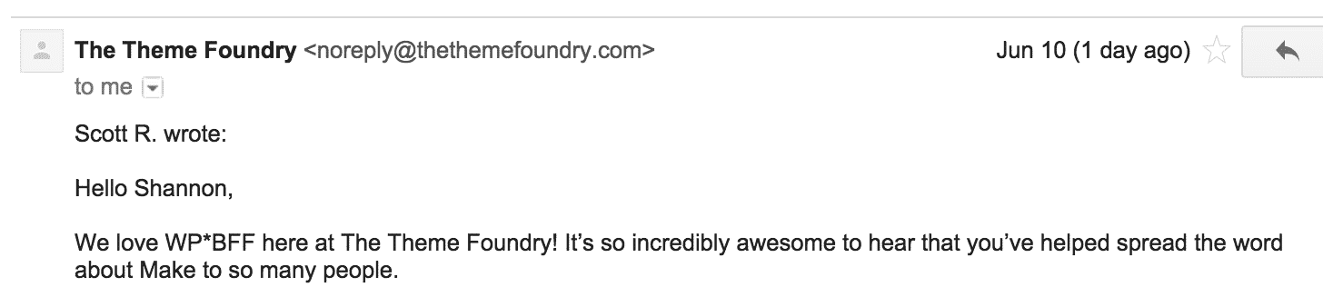
So you guys already know how much I love the “Make” theme, and I was super-stoked to hear that they love me back! If you didn't already know, my love language is Words of Affirmation…
 And while this love affair is hot and heavy, as with any relationship, there are trade-offs.
The biggest one for me is how Make handles the header background image. It just doesn't do well on mobile. It was designed to be a background image, not necessarily THE image, if that makes sense…
As I mentioned in my last post about the header there are TONS of ways to configure the header AND to get the site to display how I propose as the perfect homepage layout, we need to take into account how sites display on mobile when setting up the header.
If you didn't design your header image with mobile in mind (most of us probably didn't, and I didn't really mention it in my video…) you may want to make a few changes.
This is a classic case of one-size-does-not-fit-all, and it's where many of you run into trouble getting things to display the way you want.
In this article, I'm going to give you some tips and tools for making sure your site displays well on mobile.
Step 1: See how your site looks right now.
Here's an awesome resource to see how your header image will display on different devices.
So do me a favor – go to that website and enter https://shannonmattern.com and click GO.
Check out how my header image sorta re-sizes, but gets covered by other elements on the screen depending on what device is viewing my site.
I could have done a better job positioning my logo so that it displayed well on every device, even though my face gets cut off… But my logo is more important to me than my face, and I'm cool with my mug not showing up on an iPhone.
Update: Ignore all of option 2!! I've got a new solution that fixed my face getting cut off without me having to change ANYTHING about my banner! Solution will be posted in detail with a video SOON. Hold tight!
2) Open up your banner image in Canva, and position your most important elements near the center of your header image – i.e. your logo, your tagline, your face (pick the most important one to center for mobile)
Upload your image, see how it looks on different devices.Go back to Canva, make some tweaks, re-upload.Repeat until you are happy.
This takes some trial and error, and it can be a little frustrating… I'm not gonna lie. I've asked the awesome folks over at Theme Foundry for a fix – but there are no guarantees.
Another option is to lay out your header completely different than what I teach in Day 3. Check out this video of Make Header Options that I put together to show you the alternatives. These are all great alternatives to what I teach in Day 3, you'll just need to re-think your graphics.
And my last suggestion is to remove the header image and logo spacers altogether and just add Banner sections to all your pages set to 400 pixels tall and Responsive Behavior to aspect, and plunk your header image in there. The only caveat? It won't display on your blog posts page or your single blog post pages… Pretty big caveat. You may want to also add a separate Logo image and play around with the layout in Appearance > Customize > Header > Layout (and you may need to set your Main menu to the primary menu in Appearance > Customize > General > Navigation)
Other themes do this header thing really well. Headway is one of them – but it is incredibly complex and frustrating in other ways… Like I said, there are tradeoffs.
Hopefully with all my BFF clout I'll be able to sway Theme Foundry to make a few tweaks to the theme so it displays our headers beautifully on any device! Update: yep, they totally came through for us! #iusemake #i<3awesomecustomerservice